BRAND IDENTITY
Travco Properties (TP) is the youngest subsidiary of Travco Group. Building on the group’s 35 years of success in Tourism and Hospitality, owning and operating the largest number of hotels, resorts and cruises in the Middle East and Europe.
Objectives
– Establish the name of TP in the market, leveraging the success of their new properties in Almaza Bay
– Build brand awareness
– Build the corporate brand image
– Establish the company’s platforms and communication strategy
Design Direction
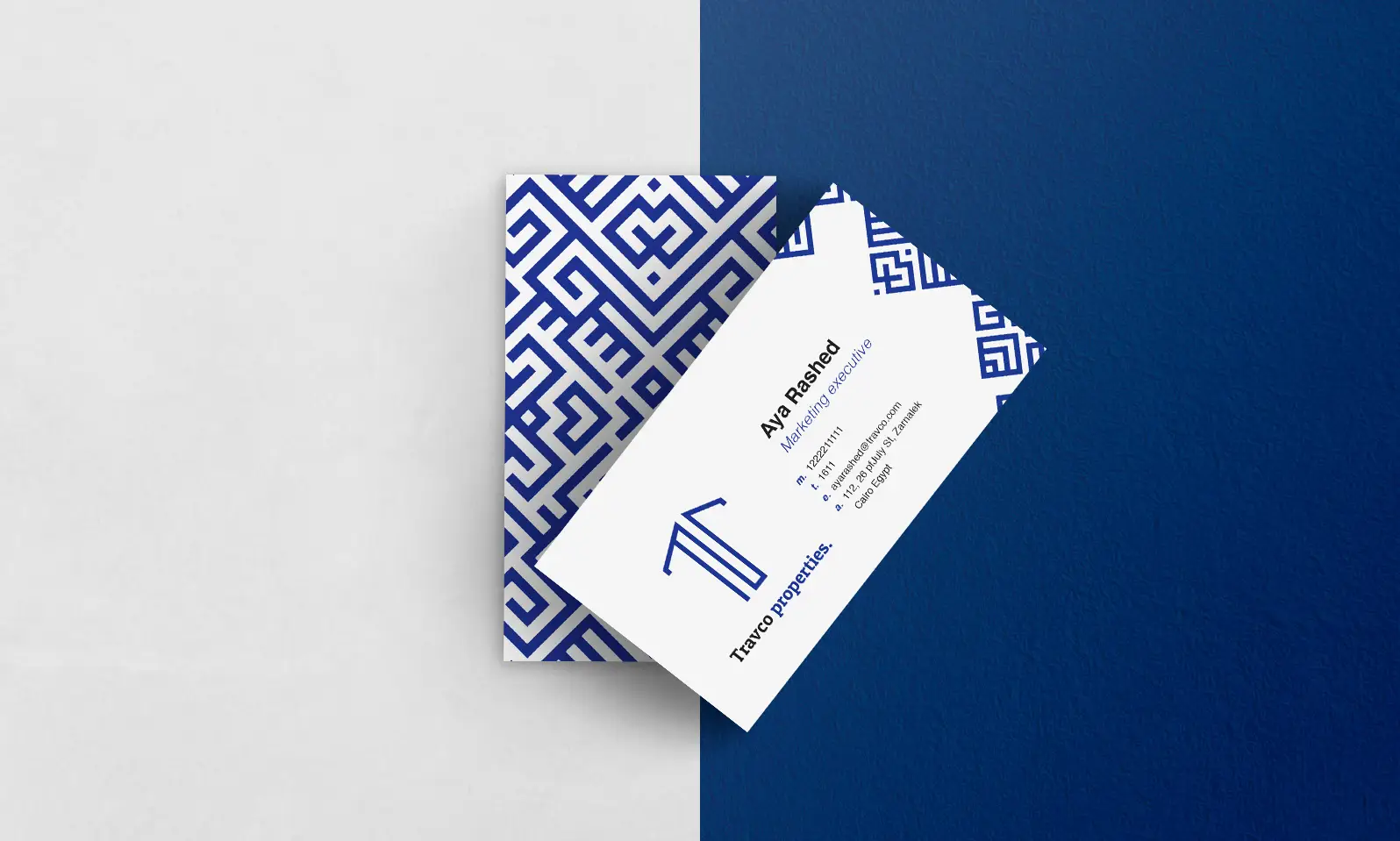
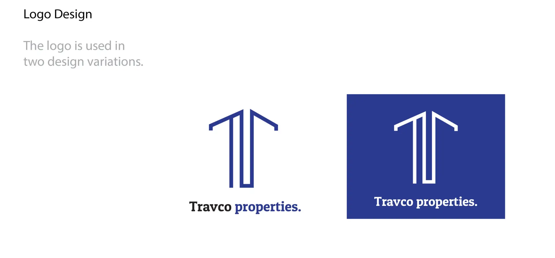
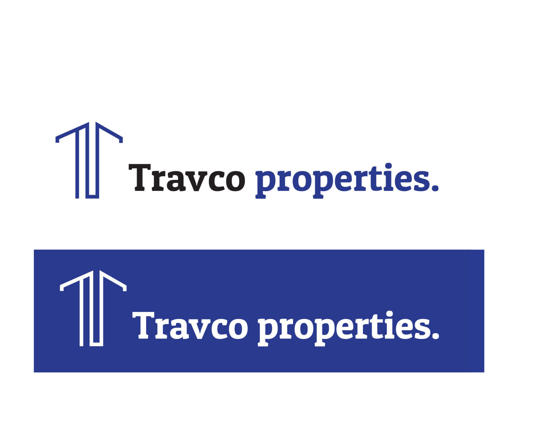
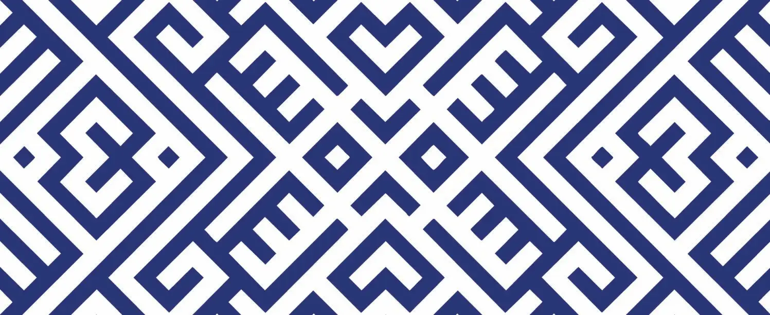
For this design, I strategically incorporated the initials from Travco Properties to form a subtle yet dynamic outline, reflecting the shape of a building or property within their portfolio. The result is a modern and sophisticated visual identity that subtly references both the brand’s initials and its real estate expertise.
Travco Properties’ visual language is a system designed to visually represent the company. It reinforces the company’s values and core purpose. It functions to create strong brand recognition and recollection. And for that reason, I designed the pattern to incorporate the geometrical angles of a building and be inspired by Arabic patterns. The pattern is adjustable.
Mission
Travco Properties aims at widening the arena of real estate offerings in Egypt creating sustainable and self-sufficient developments. Its main goal is introducing a new perspective to mixed-use developments by developing alternative, progressive, urban and beach communities.
Deliverables
1. Brand identity (include logo uplift along with corresponding applications)
2. Positioning exercise a.Tone of voice and messaging b. Company’s vision & mission statements, along with secondary values
3. Communication templates (press, magazine, website (content + template), online banners, events and social media (Facebook, Snapchat and Instagram Posts))
4. Direction of Imagery to be used
5. Campaign concept to be further developed with Marketing Team.